Portfolio

P. Allen Smith Social Media Branding
P. Allen Smith’s social media identity was inconsistent for many years. Content was being pulled from 3 different TV shows, printed materials, and e-newsletters – all with individual visual styles. This created confusion and inconsistency with the brand’s online identity.
I was tasked with creating a visual package that would be applied to all future social media video posts to create a cohesive visual identity. This presented multiple challenges. First, it was decided that all social media videos would be posted in a square format. This was a challenge because everything shot for social media also has to be used as show content, which is 16:9 format. Second, all of the social media videos would be edited by off-site freelance editors who are not always going to be designers. Finally, how do you stand out in a scrolling news feed full of other square videos?
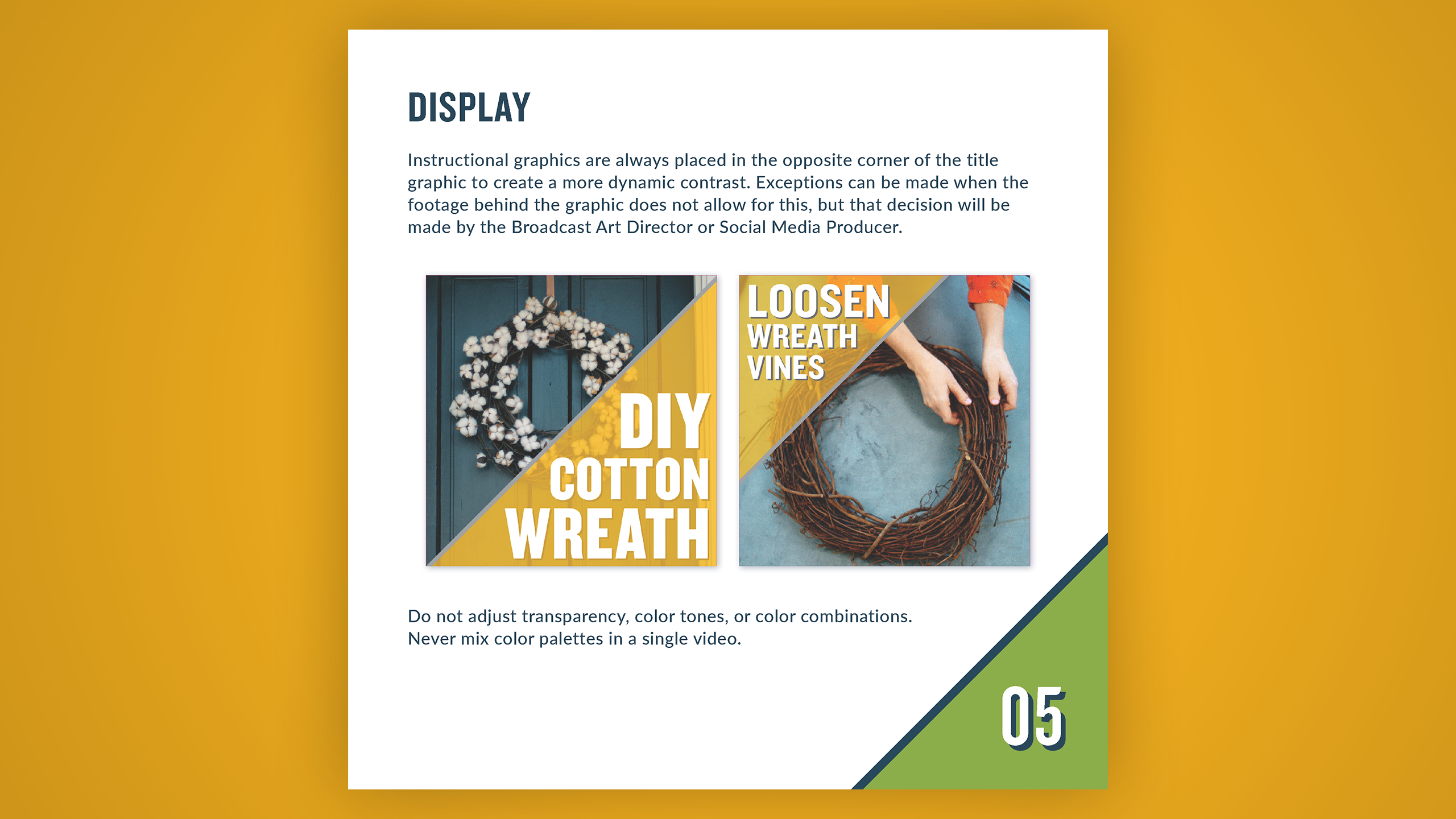
The final design solutions were to split the square frame on the diagonal to differentiate from the more common approach of splitting vertically or horizontal, create a set of pre-paired color combinations for editors to choose from, and using a bold sans-serif font with 18 weights and widths to allow for flexibility and creative type combinations while using only one font.
Once I settled on the graphics package designs, I created a style guide for the editors to explain the intended use of all the design elements as well as how the videos are meant to be edited. I also edited multiple sample videos to be sent out with the style guide.
STYLE AND EDIT GUIDE
VIDEO SAMPLES


You must be logged in to post a comment.